UI&UX Design
My UX projects...
Doing some UX Design for game UI taught about readability and ergonomy. My objective is to provide essential informations to the user, with an art style that has satisfying feedbacks and following an accurate Art direction.
Here are some UI works I have realized using Unreal Engine 5, Unity, Figma and Adobe XD.
These projects contain designs from other games that I have reworked on my spare time while respecting the original Art direction and improving the User Experience and the UI Art.
creativity
creativity
creativity
Slammin Legends
This is the graduating project I have realized during my 3rd year of Bachelor, as the Project Manager and UI designer of a team of 28 students. I had to imagine various designs to communicate infos to the players while keeping a readable interface during high-paced actions.
The project was awarded several rewards like Game of The Year 2022 Finalist (The Rookies, 2022), Excellence Award (The Rookies, 2022).
+
+
+
+
+
+
+
+
+
+
+
+
+
+
+
+
+
+
+
+
Select a project above to see my design process.
More of my work
More of my work
More of my work
The crew 2
A personal project, March 2024
On my spare time, I decided to rework some parts of the interface of The Crew 2, I got interested in the Summit interface and the event tickets. You will find below the design process I have been through to realize them. Most of the assets displayed were designed by me, following the game's Art Direction. Don't hesitate to check the current game interface of
The Crew 2 to see what I have reworked, you will have access to it down below.
1. The Summit
A short video introducing my design for the Summit interface and the assets I have realized.
Analyzing
the original Summit menu was the first step in order to improve its design.
I first focused on readability, by designing a different disposition of the activities and skills. I chose to add more space between them to focus better on each information given by the activity.

Original

Rework
My reworked version of the Summit's wireframe
Then, for the design of the activities I wanted to display the rewards the players could get as it was one of the main motivations for the players to complete a race. Also modifying the colors to improve legibility.
Original

Rework
Color changes

Rewards
Concerning the weather conditions of each race, I chose to move them alongside the constraints in order to
regroup every details about the race at the same place, following the Gestalt's law of proximity.
Original

Rework

Weather indication
For the ranking leaderboard I wanted to insist on some informations, like the current rank of the player and the rewards he could get for each rank.
To increase the readibility I also moved the remaining days right next to the date of the event to respect Gestalt Law principles.
Days left
Original

Rework
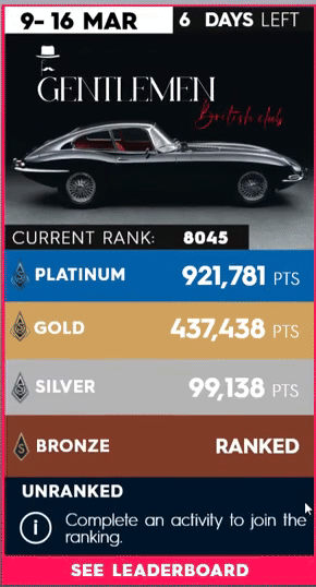
Date contrast
Rank above points
Available rewards
Finally, since my version of the Summit allows the player to slide horizontaly to check the other activities, I wanted to have a static reference to the ranking evolution of the player at the top of the screen to keep the users informed of their current rank.
Ranking evolution bar

Reworked Summit interface
Designing
a reworked interface by creating assets that follow the original Art Direction.
The objective for me was to be able to create my interface with a similar look to The Crew 2. So I used the original color palette and created my own UI assets.

Original

Rework

A unique design I made for my Summit Event
The Summits are weekly events in the game, each week is a new theme. So in order to have a coherent overall design I quickly made the cover of the event taking some inspiration from the previous in-game Summits.

Then I recreated the Skills logo of each race by respecting their guidelines (paint drips, folded paper, vectors...); as well as the background for every activities. I have was inspired by the original designs to make the following backgrounds:


Street Race logo
Street Race skill BG
Street Race BG

Freestyle logo

Pro Racing

Freestyle skill BG

Pro Racing skill BG

Freestyle BG

Off-road BG

The designs I have made for the activities
2. The event tickets
Original event ticket interface
Improving
the current tickets of the game also required an analysis of their designs.
I first tried to find what could be improved from the current design, and I thought about applying the Gestalt's proximity law by separating the Race informations from the rewards.
Original

Rework

Increasing space for visual
Separate user performance
from rewards
Add a '+' to accentuate the notion of reward
Once done with the overall design, I noted that it wasn't actually obvious to notice wich event ticket the player was selecting. So I decided to add a bit of motion when the player selects a ticket.
Street race rework
Freestyle race rework
The higher motion highlights the title and the type of Race. It acts as a visual feedback when the controller/mouse of the player hovers it.
Finally, I started to design the background of each ticket following the art direction of the game. However I still used the game logo of the game.
Street race rework
Freestyle race rework
Dinos VS Aliens
A group project, January 2021
During my 2nd year of Game design Bachelor I have realized a mobile game with a team of 3 other students. I was mostly in charge of the UI design, following the wireframe of my teammate for the in-game interface. It was my first experience as a UI designer on a game, many things could have been done differently and improved in many ways. However, it was a good experience on mobile and I learned a lot from it. The assets and interfaces you will see below were done by me, but I will also precise it when I'll join the wireframe designed by my teammate.
The trailer I have realized for the project using Adobe Premiere Pro, and Photoshop to make the visual assets
1. The store

The logo
I designed for the game was supposed to embody the main elements from our concept: Dinosaurs and Aliens. So I try to emphasize their opposition through those contrasting styles in the logo.
Logo design of the game
Designing
the shop interface was a first way to explore the mobile format.
We first created some wireframes of the shop, and tried to improve them as much as we can.

1st iteration

2nd iteration
3rd iteration
2. The in-game UI
Gameplay from Dinos VS Aliens
Wireframing
the game interface started with very sharp designs, which evolved over time through an agile project methodology. I adapted to the requirements from the UX team and game designers.

HUD

Battlepass menu

Pause menu
Lessons learned
were huge and if I had to re-do it again I would change plenty of design choices and follow the Gestalt laws of proximity and similarity way more frequently. Moreover, I realized afterward that the UI wasn't as readable as we thought, and the UI art could be improved. However, as my first game project as a UI designer, it improved my conception of gaming UI and taught me the importance of iterations.
Slammin Legends
A graduating project, October 2021
As for my graduating project, I worked in a group on Slammin Legends as the project manager and UI designer of a team of 28 students. Working on the UI was challenging because of I needed to convey every crucial informations through the UI while keeping it clear and readable. But it allowed me to work closely on the signs and feedbacks to support my design intentions and create a better experience. I really enjoy working on this project as a UI designer, I was able to learn a lot and explore diverse methods of design.
I was mainly inspired by the UI of Overwatch for its disposition that provides a clear sight and just enough information to the players. For the visual assets I was inspired by Apex Legends interface, more specifically for the ability logos.
The game was also awarded in a renown contest gathering more than 4000 entries. The game was selected for the final by a jury of 50 professionals from multiple industries.

Excellence Award

GOTY Finalist Award 2022

Draft Selection Award
1. The game logo
Create
the logo of the game required different iterations and needed to match with our Artistic Direction ("A. D").
We explored multiple styles at the beginning of the project, but we finally decided to go along with the retro-futuristic 70's vibe.
Slammin Legends logo
I wanted to design a logo that could embody the sporty and competitive values of our game. However the Art Direction changed a few time before we made our final decision, hence I had to design various logos.
1st iteration
2nd iteration
3rd iteration
First iterations for Power Smash Ball logo
At the beginning, the game was set to be a competitive game taking place in a futuristic environment: Power Smash Ball. The color palette was pretty classic, and it was using the Sport League design codes.

First iterations for Slammin Legends logo
2. The Artistic Direction
Defining
the Artistic Direction was an important step to do in order establish the color palette and the kind of vibes I would have to emphasize in my designs.
Having a colorful and 70's direction allowed us to explore interesting shapes and use flat colors.


Slammin Legends gameplay demo
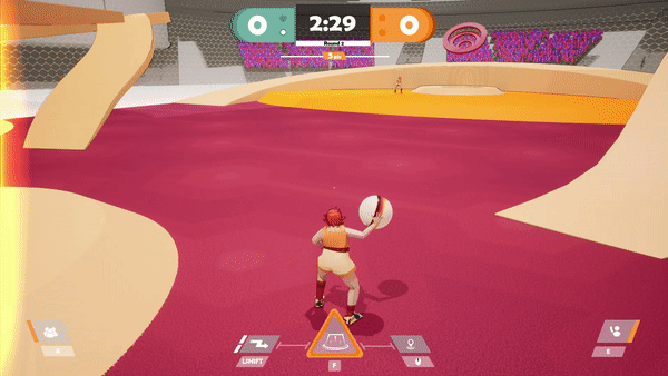
3. The in-game interface
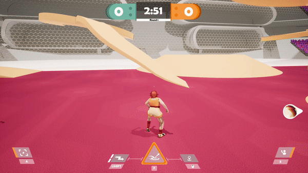
High paced
games usually needs a simple UI to let the player focus more easily on the gameplay, but it also needs to provide important signs and feedbacks to the player.
I went through different iterations, improving them after each playtest in order to find what informations matter the most, and how could I provide them correctly to the players.
Current in-game UI
The interface evolved a lot from the beginning of the development to the end. It is very dynamic and is being well-supported by the other feedbacks in game.
I also worked on some diegetic UI to avoid using too much screen space with 2D assets that may prevent the player from seeing the ball or the other players.
The UI elements are positioned on the edges of the screen to allow a wider screen space for player focus.
First Scoreboard version

1st iteration

2nd iteration
Second Scoreboard version
Abilities display
Score multiplier UI
Third Scoreboard version
with transparent background
New abilities interface
.png)
3rd iteration
The scoreboard also had to be iterated in order to provide a clear space for the player to pay attention to stay focused gameplay. I had to provide informations about the score, the rounds won, and the time left.

1st iteration
The 1st iteration was embodying the colors of each teams and displaying the timer and the current round. But the 70's mood wasn't stressed enough.
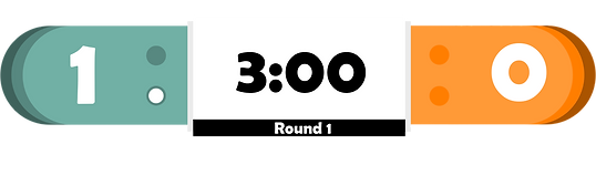
2nd iteration
The 2nd iteration mainly used the same elements as the first one. These elements were visible enough, however the players happen to look up pretty often, and the ball can sometimes be hidden by the scoreboard. So I added a dark translucent background where the player can still see the ball through it.
The HUD
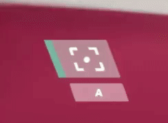
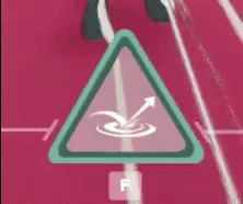
displays different mechanics that rely on a cooldown for usage. There is a control mapping reminder under each of them to slightly reduce the memory load of the player's brain to remember each input.
Here some of the UI assets I have realized for the in-game UI:
Ask for a pass
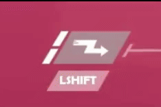
Dash
Ball Focus
Ability
These HUD elements are also dynamics, because a change in motion as a feedback can be noticed in the peripheral vision of the player. Knowing that the player will focus 80% of the time in the center area of their screen, it can be pretty useful.
Current in-game UI
Abilities
also have a different logo to be recognized, I needed to design something that would be easily identified. The form of the ability logo should follow its function.
Wall
.png)
A wall raising from the ground up, the arrows symbolize the motion.
Jumpad
.png)
A jumpad boosting up velocity forward to the ball and the player.
Speed-Bubble

A buble speed that accelerates everything that pass through it.
Abilities Gameplay Demo
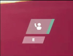
Informing
the player about the position of the ball while not looking directly at it could be challenging. This is why I thought about a marker that would indicates the position of the ball on the edges of the screen.
Ball marker demo

Blue team possession

Neutral team possession

Orange team possession
The ball marker also has different colors depending on the team carrying the ball. This is an important feature because since the ball marker appears when the ball is out of the player's screen, it provides the information wether he has to defend the ball or keep running to the adverse opponents ring.

Cherry's marker

Troy's marker

Ace's marker
When the player has the ball, he doesn't need the ball marker anymore. So this one is replaced by the "pass marker", which is triggered whenever a teammate is asking the ball. Like the ball marker, it indicates the location of the ally who asked for the pass.
Knowing
the location of his teammates is important for the player when he has the ball. We can already know the location of the teammates asking the ball, but we needed another sign to constantly be aware of the location of his teammates.
To provide that information I didn't want to add another marker as it could add too much activity in the player screen and could be distractive.
I thought about the "sidebars" on the edges of the screen that glow up in the direction of an ally whenever he is nearby and in a certain range. The glow up effect is noticeable by the player while focusing on the center of the screen at the same time.
Left sidebar
The "sidebars", indicating the location of the closest ally